How to Draw Portraits
How to Draw Portraits
Anatomy Lesson 19 – Part 2
In this video lesson, you will discover how to draw portraits.
How to Draw Portraits
This video part demonstrates how render tonal values in graphite pencil. For the job, I will use three well-sharpened graphite pencils. You may go for HB and 2B grades of graphite.
Always make sure your pencil has sharpened lead. It is very difficult to achieve good-looking pencil strokes with blunt tips.
I begin rendering places, which are the darkest.
At this step, I do not concentrate on small details, instead, I block out the dark areas visually separating them from light parts of the head.
It is very important to apply light pressure on the pencil in the beginning.
When considering how to draw portraits, remember that the tonal rendering has to progress very gradually, so you don’t want to use the full strength a pencil can provide.
Good rendering has to be done in multiple layers. We will come back to the same areas to darken them up several times while developing the range of tonal values.
For this step, I’m using the “candle” pencil grip. It provides a greater freedom of strokes and faster rendering.
In the Drawing Academy Course, I explained in detail various ways to hold a pencil and applications for every case. If you want to learn more about drawing materials and how to use them, you may enroll in the Drawing Academy online.
When depicting tonal values, I do not concentrate on rendering one particular area of the portrait, but instead doing various parts in quick succession, one after another. This technique serves two purposes. First, I am gradually developing the entire drawing, darkening various shades simultaneously, keeping it balanced and complete at all times.
Second, I’m also changing the focus of my attention from part to part so I don’t get used to one particular area, which helps me to avoid mistakes in tonal values.
For smaller details and more precise work, I employ the writing grip, using three fingers to hold the pencil. The index finger is pushing from the top, middle finger supporting from below, and the thumb keeping the pencil secure from the side.
The pencil shaft is pointing directly to my right shoulder. Of course, if you are left-handed, the pencil should point into your left shoulder.
Gradually, I’m darkening up the shades on the head.
When it comes to the topic of how to draw portraits, it is best to apply pencil strokes along the shape contours.
Do not confuse contours with outlines. Any object has an indefinite number of contours. These are virtual lines that can be produced by intersecting the surface of the object by a plane in any direction.
In the Drawing Academy.com website, you will find a free video lesson that explains contours in detail.
Shading along these contours helps to reveal the three-dimensional surface of the object.
When drawing in graphite pencil, it is very important not to smudge pencil strokes with a blending tool or your finger. It is an amateur mistake. By blending graphite marks, you will get mud, which is very unattractive in a drawing.
The beauty of the graphite artwork is in separate, nicely performed strokes. Instead of smudging, you need to learn how to make your pencil strokes look attractive and beautiful.
It is a good practice to put a clean piece of paper under your hand so you don’t smudge graphite marks.
I have seen many drawing demonstration videos on YouTube where amateur artists, and so-called art teachers, are smudging graphite pencil. Next time you see this technique, just be aware that such presenters do not know correct, traditional drawing techniques. Don’t pick up these bad habits.
I once more would like to point your attention that correct rendering in graphite pencil should develop gradually. All areas of the portrait need to be worked on simultaneously, so the tonal values will become deeper in all places. It’s like developing a photograph. First, the darkest areas start to appear, then mid-tones, and all tonal range becomes darker step by step.
This is the correct way to work on rendering tonal values in graphite pencil.
Don’t be afraid of showing your pencil strokes, even in smooth areas, like the cheek for example. Pencil strokes are your unique signature. They contribute to your creative style and make it recognizable. You don’t want to smudge your style and signature.
When rendering tonal values, you have to constantly compare various areas of your artwork to each other and to the model. Don’t just fill in white spaces with pencil strokes, mindlessly.
Constantly run a question-and-answer conversation in your head. Ask yourself such questions as, is this area darker than that one, is contrast between these two spots is deep enough, is it dark lights or light mid-tones, is it dark mid-tones or light shadows, what is the best direction of the contour that describes this shape, and so on. Only by asking and solving such questions you will be able to achieve better results than just copying what you see.
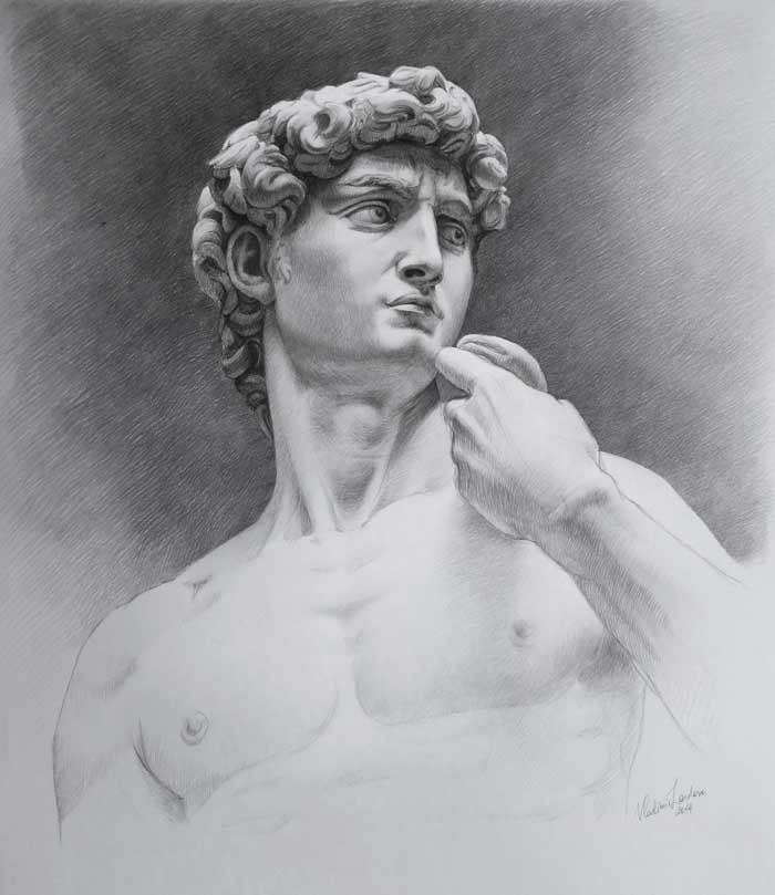
You may use different kinds of pencil strokes to differentiate the background from the model. I’m using longer, diagonal, parallel, and cross-hatched strokes for the background. This rising left-to-right diagonal emphasizes the contrapposto poise of the model and direction of David’s gaze. Such hatching is also making the artwork more dynamic and dramatic, which coincides with the Michelangelo’s creative task, which he executed so well when carving this statue.
When artwork looks almost complete, it is time to emphasize some deep shades, once again, and put some finishing strokes on the portrait. You can once again analyze the model and compare it to the drawing. You can make some final accents and minor corrections.
As drawing becomes darker, it is more important to keep a clean sheet of paper under your hand. It prevents accidental graphite smudging.
When smaller details are finished, and I’m satisfied with their tonal values, it is time, once again, to unite areas of the drawing by applying longer strokes above smaller details.
So the sequence of rendering tonal values begins from big areas and then proceeds to smaller details after which it progresses to bigger areas, once again, and returns to small details, thereafter.
Such sequence can be repeated several times, layer by layer. Every time, your artwork will become more developed with darker tonal values.
Here is an excellent rule to check whether you are doing tonal rendering in the correct way. If you can stop working on your artwork at any given point, it might look unfinished, but complete, you are doing tonal rendering correctly.
It is good a practice to stop working on your artwork just before you think it is finished. This will prevent your artwork from being overworked…
This is a very brief overview. To find out more, enroll in the Anatomy Master Class.
[ The full lesson is avaibale to Anatomy Master Class members ]